


Music for Illustrators

A brilliant artist I follow on twitter aaaaaalmost Rick-rolled me by using pieces of the melody to “Never Gonna Give You Up” in an illustration. It was such a brilliant idea, but it didn’t quite pass muster because of some inaccuracies, so I’ve been thinking about how music often gets illustrated.
I grabbed every picture book I could from my (small, rural) library and let their illustrations guide me. I’ll present some examples and provide a bit of training with asides. Even if I’ve gone overboard and you lose interest/patience, the big conclusion is this:
If you illustrate music, the more *real* you want it to look, the more accurate it must be.
Why?
1) Out of respect. You wouldn’t write “KATT” or 2+2=5 or o-/\| = Korean (and you’d better not draw a penguin on the north pole)!
2) Educational opportunity. We know the arts (especially in public schools) aren’t doin’ so great. Fight! Even if it ain’t yo thang, let’s give readers every chance to get into music!
Example: my five-year-old sees me compose music. Here is his version:

Music notation is GORGEOUS. Calligraphic, expressive, vast and elegant. I love it and I’m excited to get into it! Let’s look at some examples.
Baby Shark. We all know it (and we all feel the same way about it).

I like that the text moves. Surprisingly, there are very few musical notes to indicate that it’s music (but the trumpet ain’t a bad representation). Still, in line with my first point, there’s a missed opportunity here to educate.
(Surely there’s a grownup out there who was in middle school band who’d attempt to read the music. That could be invaluable for a kiddo to witness—and fun for the grownup to remember!)

Quick lesson:
In my top Baby Shark illustration, there are a few types of notes used:
BA-BY… Half-note (1/2) - a hollow notehead and a stem
SHARK, DO DO DO… Quarter note (1/4) - a black notehead and stem
DO-DO, DO-DO… Eighth note (1/8) - looks like a quarter note but is beamed with another 1/8 note (horizontal line connecting the stems) or has a lil’ flag (flags always flap to the right).
Keep an eye out for 1/8 notes (more details in bit)!

Pete the Cat; The Petes Go Marching (James Dean) has another missed opportunity. We know the song. Why not include the music notation? This is a great comparison to Baby Shark because it’s in a different time signature (it has a different rhythmic feel).

Baby Shark is in 4/4 (four beats per measure, ie 1-2-3-4, 1-2-3-4).
The Ants Go Marching has the feel of 3s, like a fast waltz or a sea shanty (1-2-3 1-2-3, 1-2-3 1-2-3)
Clapping (or event counting) along with the song will help you get a feel for what I may not be saying very well…

The Library Book (Tom Chapin and Michael Mark / Chuck Groenink), has the music as its endpaper. I love this! I learn a piece of music and can sing a story (and there’s no pressure for non-musicians because it’s not in the story). I sing the refrain when I read this at storytime and I show the music (ask me for—or share with me—musical storytime ideas!)
Quick lesson:
Lyrics are divided into syllables, but the word will still be connected with dashes. And punctuation is included (very helpful)!
The endpaper also shows us different kinds of noteheads. Here, the X (instead of the usual oval) means to say the note, don’t worry about the pitch.
Here’s an example of music notation for a drum set, which utilizes different noteheads. Each line/space represents a different drum/cymbal (more on the staff/staves in a moment):


One more cool thing about The Library Book. The text moves—this time it rolls with the contour of the music. Once you know the song (and you can always YouTube it), you can see how this line follows the melody!
Edit: I was wrong. The contour here is close, but not so on the other pages, leading me to believe this is more a happy accident (and a great idea for next time!)

When teaching/showing someone how to read, do you ever put your finger on the words as you go? In this case, your finger can also show the notes/words literally (and visually) going higher and lower as you sing them.
On the concept of music on the endpapers, check out these two examples, included at the end of their book:
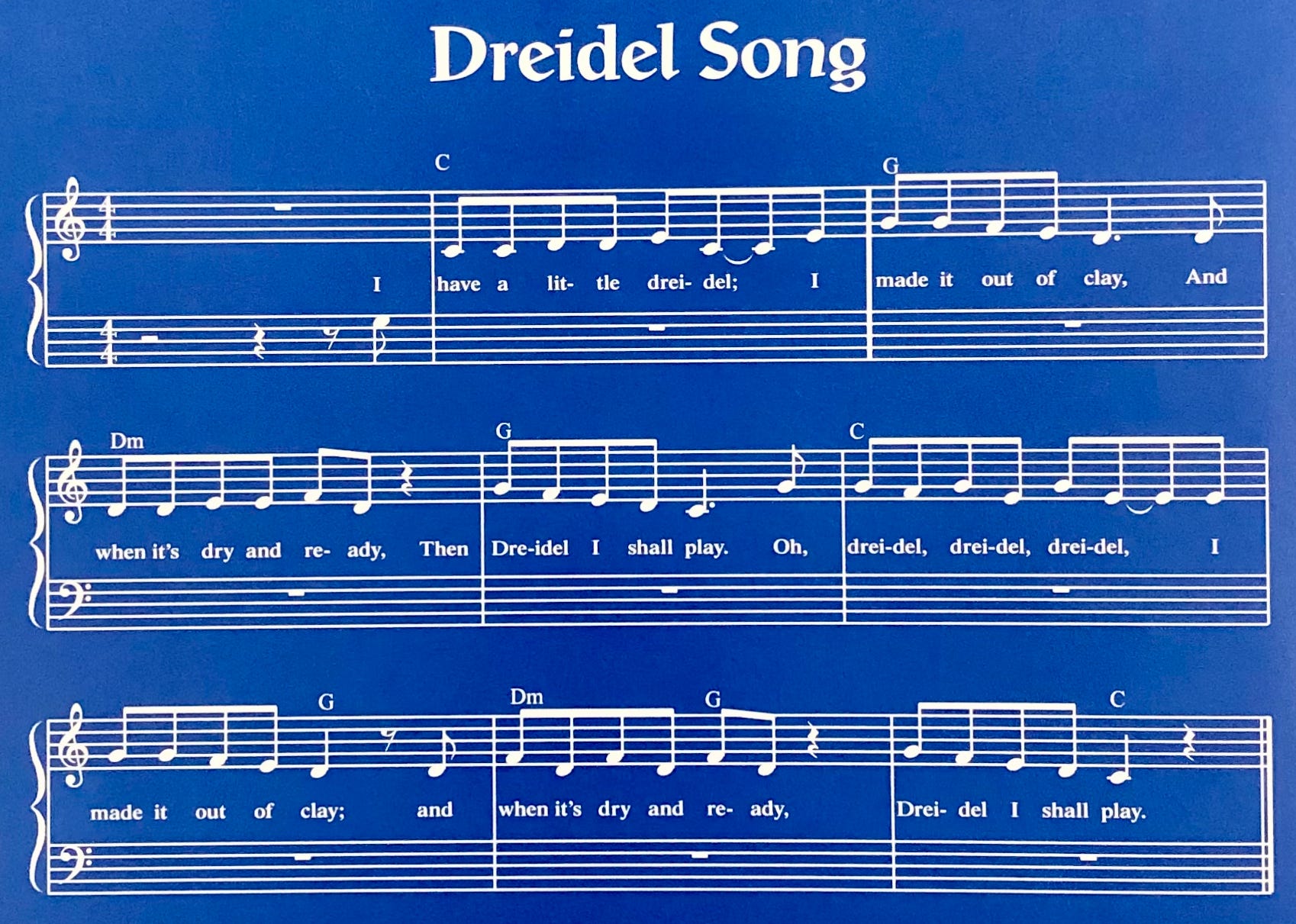

Take a moment to compare ‘em. Even without musical training, I bet you can tell that one is *easier* to read. There’s a lot to observe and learn here. Ready?
Here are some of the differences:
One is written in C Major—no key signature needed at the beginning - that means no sharps (♯) or flats (♭)
The other is written in E Major—four sharps!
Quick lesson:
Sharp ♯ - raises the pitch a half-step
Flat ♭ - lowers the pitch a half-step
Natural ♮ - returns to the original pitch
Another noticeable difference is that one is written with a steady rhythm. In Dreidle, check out the stems, which are connected by horizontal beams. The notes are also evenly spaced. Both of these help the eye follow. (Did you know that as with reading language—especially out loud—we also read ahead in music? If you’re a typography-lover, think of it as kerning and tracking, but for music!)
Planets has a lot of syncopation, meaning more stems, more beams, more rests, more flags.
Lastly, the lyrics under Dreidel are all neatly on the same line (and a good font size). The lyrics under Planets jump up and down, are very tiny, have incorrect punctuation, and overlap with the some stems. (The songs rocks, by the way, but the sheet music would be under intense scrutiny in the music publishing world.)
One common mistake they’ve both made is the use of two staves—they both say they are for Piano, which doesn’t track since a piano can’t sing lyrics. These pieces of music are actually written for voice! In fact, you can call any piece of music a “piece of music,” but only a song refers to a piece of music with lyrics.
And, as song, they both only really use the top staff (treble clef, kinda looks like a swirly ampersand—the bottom clef is called bass clef and looks like… an ear?). Both pieces *should* have been written with just a treble clef and the word Voice instead of Piano.

Sing! brings us back to the aforementioned 1/8 notes (black notehead + stem + one flag). It’s funny (and exceedingly common) that most illustrators default to 1/8 notes. They’re truly iconic. But there are so many other notes! Whole, half, quarter. And for every note, there’s also an equivalent rest.


Back to 1/8 notes, we’ve got Yasmin The Singer (Saadia Faruqi / Hatem Aly). A few interesting things: 1) Only 1/8 notes (and can you spot the two notes that have incorrect stems?) 2) The illustrator uses the same musical example in multiple places (just an observation) 3) The rhythm doesn’t quite look right (at least not without more info)—there are two beamed 1/8 notes, another stands alone, and there’s a cluster of three 1/8 notes beamed together….
Quick lesson:
In a time signature that can only break down into 2 (eg 4/4, like Baby Shark), 1/8 notes are connected (beamed) only in groups of 2.
In a time signature divisible by 3 (eg 6/8, like The Ants Go Marching), the 1/8 notes are beamed only in groups of 3.
There are meters and time signatures where you can beam notes in all sorts of ways and break the rules of 2s and 3s, but that’s beyond the scope of this post, and ya gotta know the rules to break ‘em. For example, “dog” can be “dawg” and still makes (a different kind of) sense, but it can’t be “gborf” without some context. (Hehe, gborf.)

This Magical Musical Night (Ronda Gowler Greene / James, Rey Sanchez) is a fantastic example of both illustrating music as an experience as well as a language. It’s very lyrical and the illustrations really capture movement and emotion.
I may pair it with Britten’s The Young Person's Guide to the Orchestra, and/or Prokofiev’s Peter and the Wolf to demonstrate the different instrument sounds (timbre, pronounced TAM-bur) and how they work together….


Cinco de Mayo (Emma Carlson Berne / Geraldine Rodriguez / Mark Oblinger) uses a similar style of music illustration to the second Magical, Musical image. See how both use the staff and notation? It’s still not playable, per se, but it’s accurate enough to be a strong intro (sort of like seeing an alphabet on the classroom wall before you can read. You know those symbols mean something!)
Quick lesson:
The staff (staves, plural) consists of five horizontal lines that hold the notes. Lower on the staff means a lower-sounding pitch (and vice versa)—like the left hand at the piano (using the bass clef!). The staff works like steps: each lines and each space represents a single pitch.
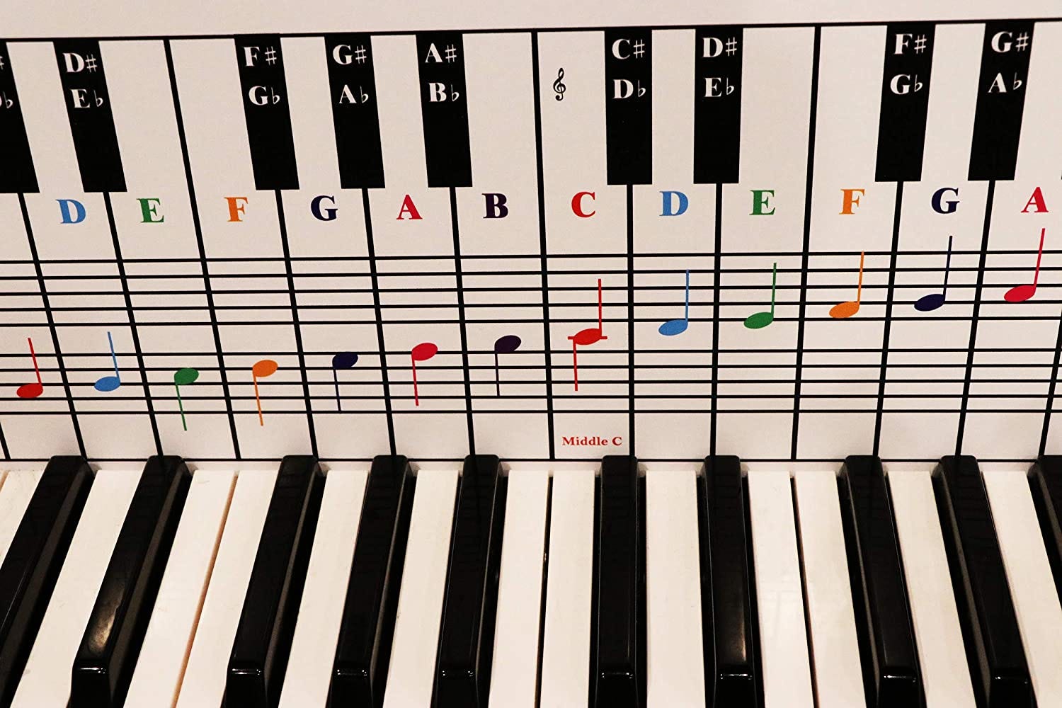
Looking at a piano, each white key is a line or a space (we use accidentals to indicate those black keys). You walk your fingers up and down the keys the same way the notes move up and down the staff. It’s in this way that the contour of The Library Book words follow the contour of the melody, curving up and down!


Every Little Thing (Bob Marley and Cedella Marley / Vanessa Brantley-Newton) and Something Extraordinary (Ben Clanton) both do something I personally really enjoy seeing: snippets from actual music. (Although the birds in the nest are singing made-up music—incorrect stems. More on that in a moment).
On that note (see what I did there?), Igor (Satoshi Kitamura) and Music is a Rainbow (Brian Collier) have a great—and entirely different—approach: the illustrations express music through shape, color, gesture, size, and flow. To me, this is deliciously risky and imaginative. (Igor also shows a cartoon-ized version of music notation that’s… close enough). And hey, both these books are by author-illustrators. Interesting….
Quick lesson:
For stem direction, if the notehead is below the center line, stems down (and to the left, like a “p”). If it’s above the center line, stems up (and to the right, like a “d”). What about the middle line, you ask? Flexible. Keep it in the direction of what’s closest or connected without dividing the rhythm.
Now, compare those two examples to this one:

A is for Oboe (Marilyn Nelson, Lera Auerbach / Paul Hoppe) absolutely nails the music notation. For me, it’s a totally different visual (and musical) experience than all other examples—I can “hear” the music in my head when I read it. I wouldn’t expect this level of accuracy unless the illustrator was a musician and/or they worked thisclosewithamusician. The illustrator even uses the train cars as individual measures, further enabling us to read the music.
And there you have it (for now).
In conclusion:
It is truly incredible how visual elements, from gestures of color and shape to the robust language of notation, can represent music. Whether it’s about feeling or accuracy, neither illustration style is better,
I do feel (strongly) that when we use *real* (formal, written-out) music in illustration, we have a responsibility to do so accurately. I (and probably anyone you knowwith musical training) would be honored to help. Seriously. Please get in touch!
Meanwhile, if anything I’ve written is unclear—or if you want more info—also get in touch! I’d love for this guide to be even more expansive and inclusive (and I’m sure there are plenty of mistakes).
Love,
Lizzie